How can wallpaper break your heart? Find the one that you love. Then find out that it isn’t made for kitchens unless you’re a character on Sex In the City who never cooks or you’re the super duper careful type (not me) or you won’t mind adding routine repair jobs to your chores or – and this isn’t really fair – you’re staging a home for sale.
Updating Oak Kitchen Cabinets
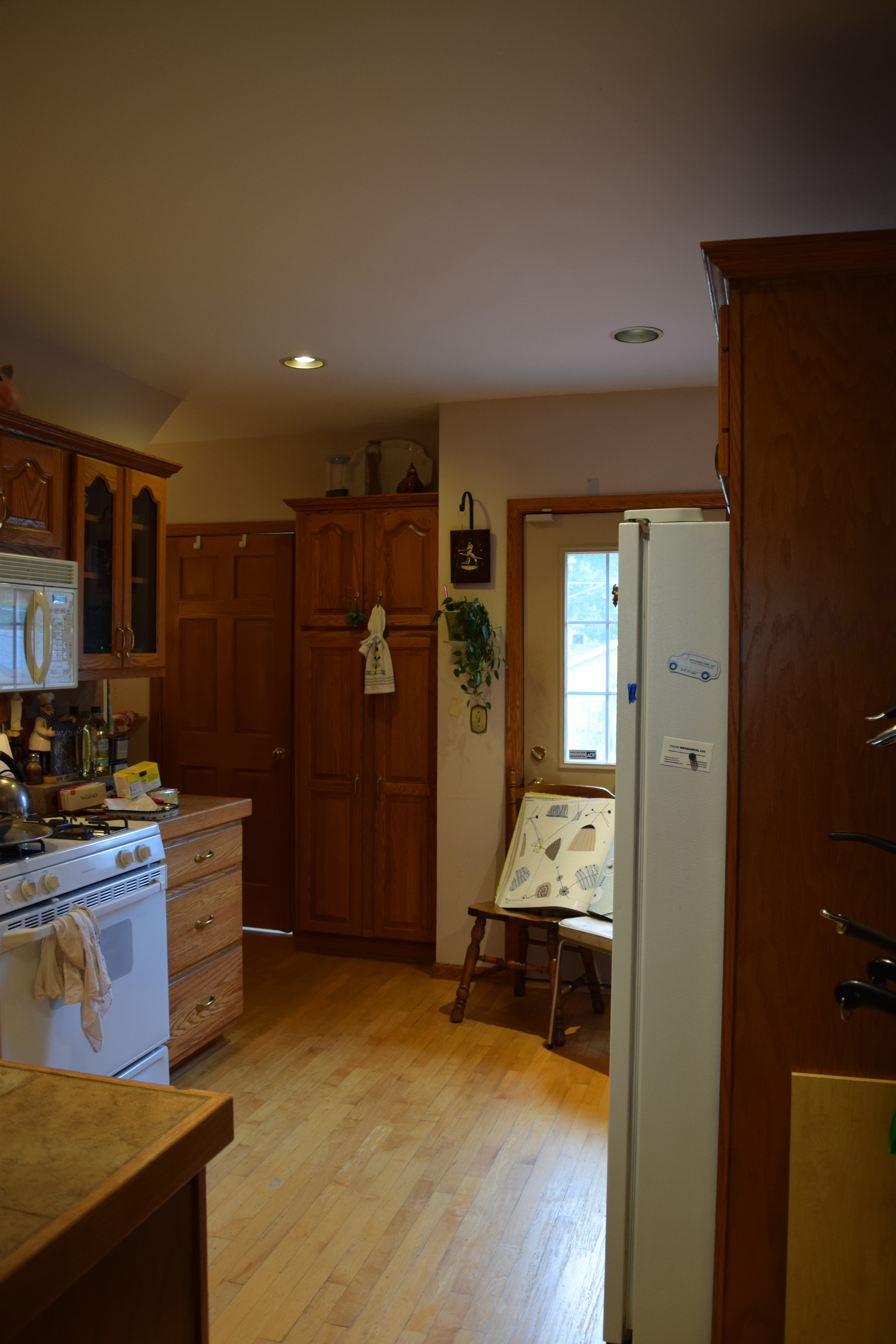
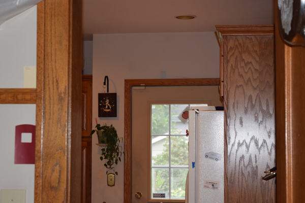
The goal is to update the kitchen working with the existing reddish oak cabinets and replacing the tiled countertops. As long as we are doing that, we’ll raise the countertops by 3/4″ to accommodate a standard sized dishwasher. We’ll also add better lighting under the cabinets.
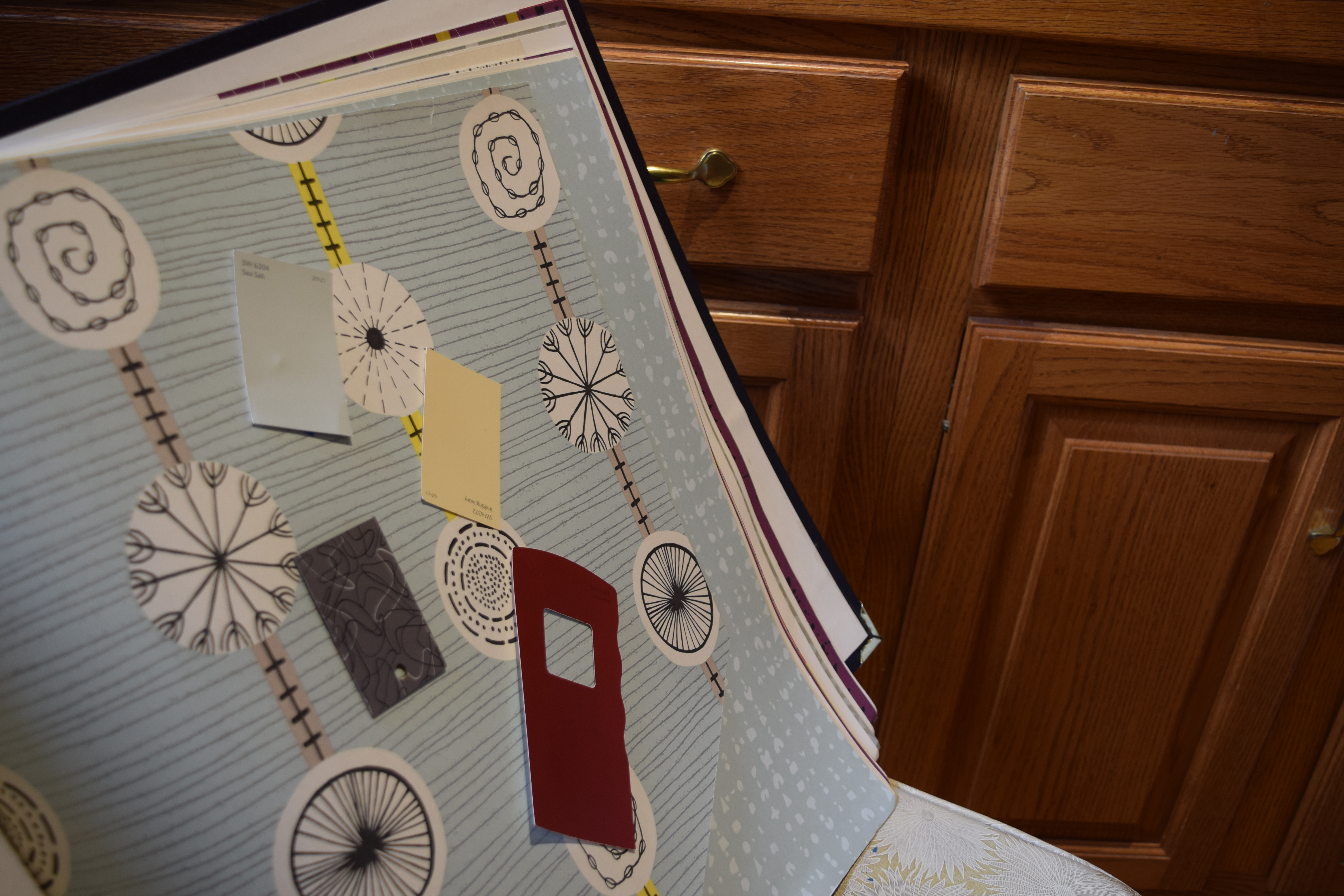
[I love this wallpaper that goes with the gray laminate we chose for the countertop. However it turns out it isn’t suitable for use in the kitchen.]
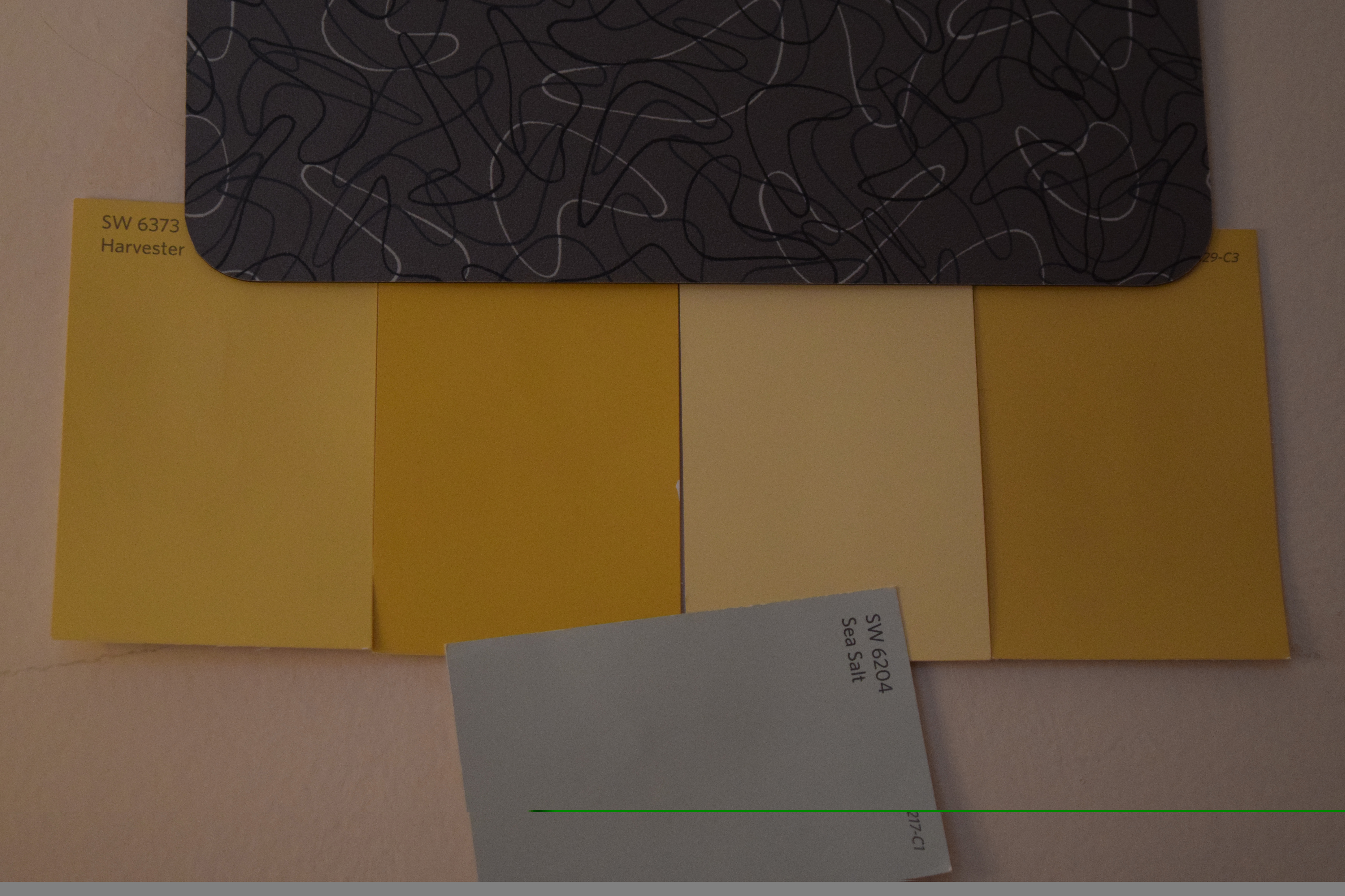
[Here you see the Charcoal Boomerang laminate with the red and the yellow that will be in the dining room. At the top you also see a sample of Sea Salt, a Sherwin Williams color that is supposed to go well with oak cabinets according to this blogger. It also happens to coordinate with Balmy, the color in our living room.]
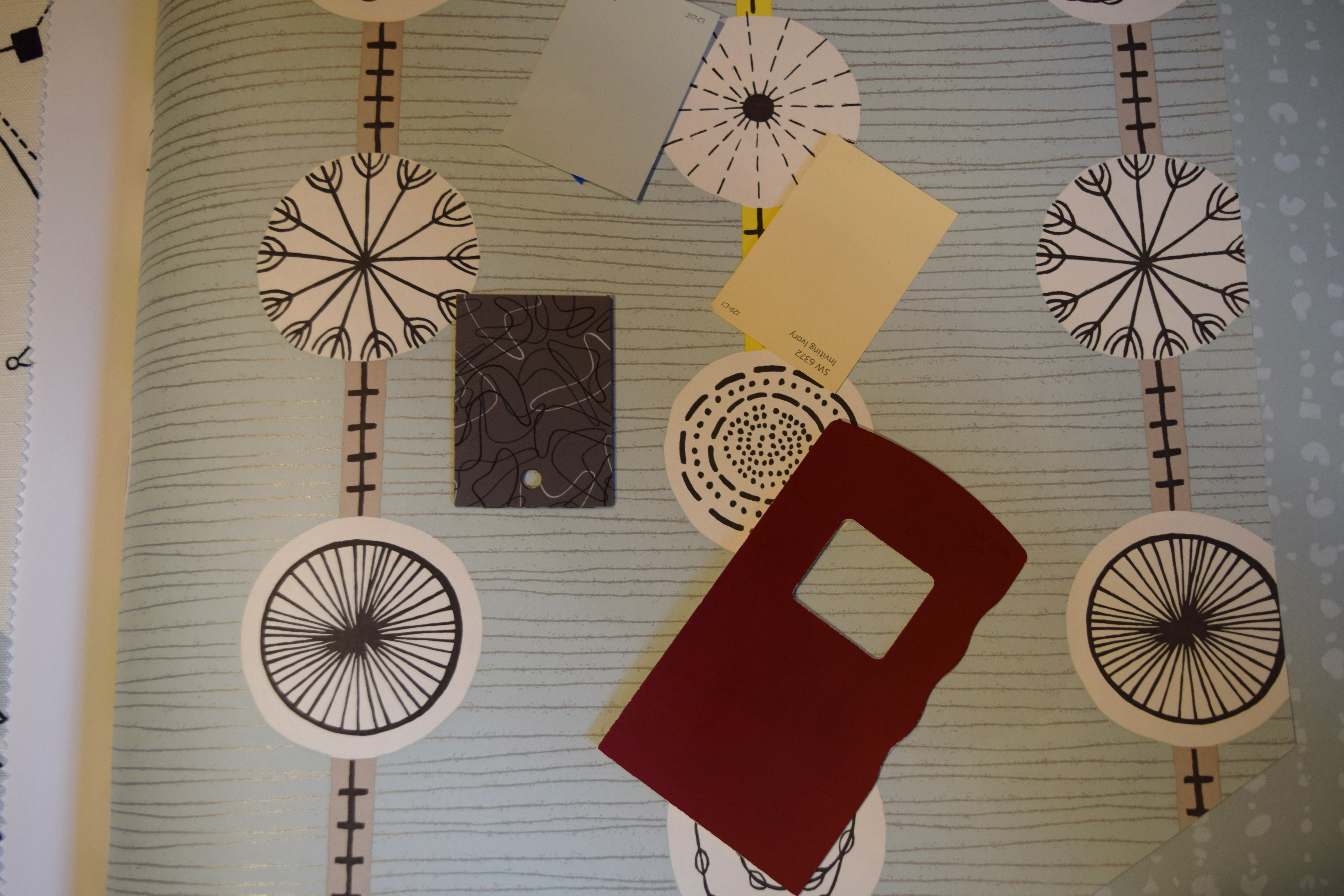
[Here it is up close. When choosing a wallpaper to go with a pattern that has a small print and some “movement”, a designer I briefly talked to at Abbot Paint suggested going with a medium pattern and straighter lines. I’m not sure this paper falls within those rules, but I still think it works.]
[The paper would have been used on the back wall that surrounds the door. But since I can’t use it, Sea Salt it will be. You see a swatch of it above the door.]
[The Sea Salt will sit behind the red and yellow in the dining room.]
[Then there is this nook to do. A shelf will be made to match the countertops. A sconce will be added if I can find the right one. But the wall is tricky because it leads to the basement, which is turquoise. The Sea Salt will work okay, but it could be better.]
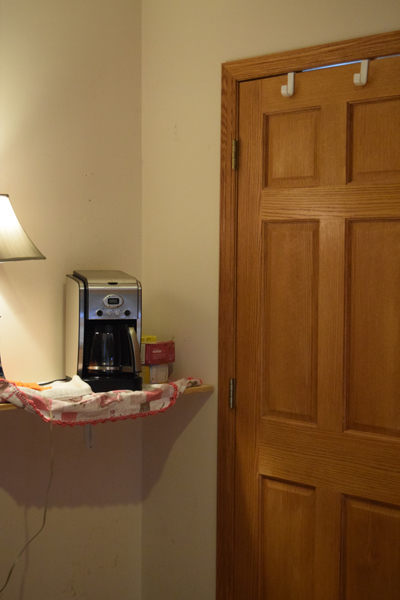
[For this coffee nook in the back of the kitchen, I thought about using the yellow from the dining room. When I was trying different shades of it, I got the idea to try stripes. Here you see it with the Charcoal Boomerang laminate and the Sea Salt.]
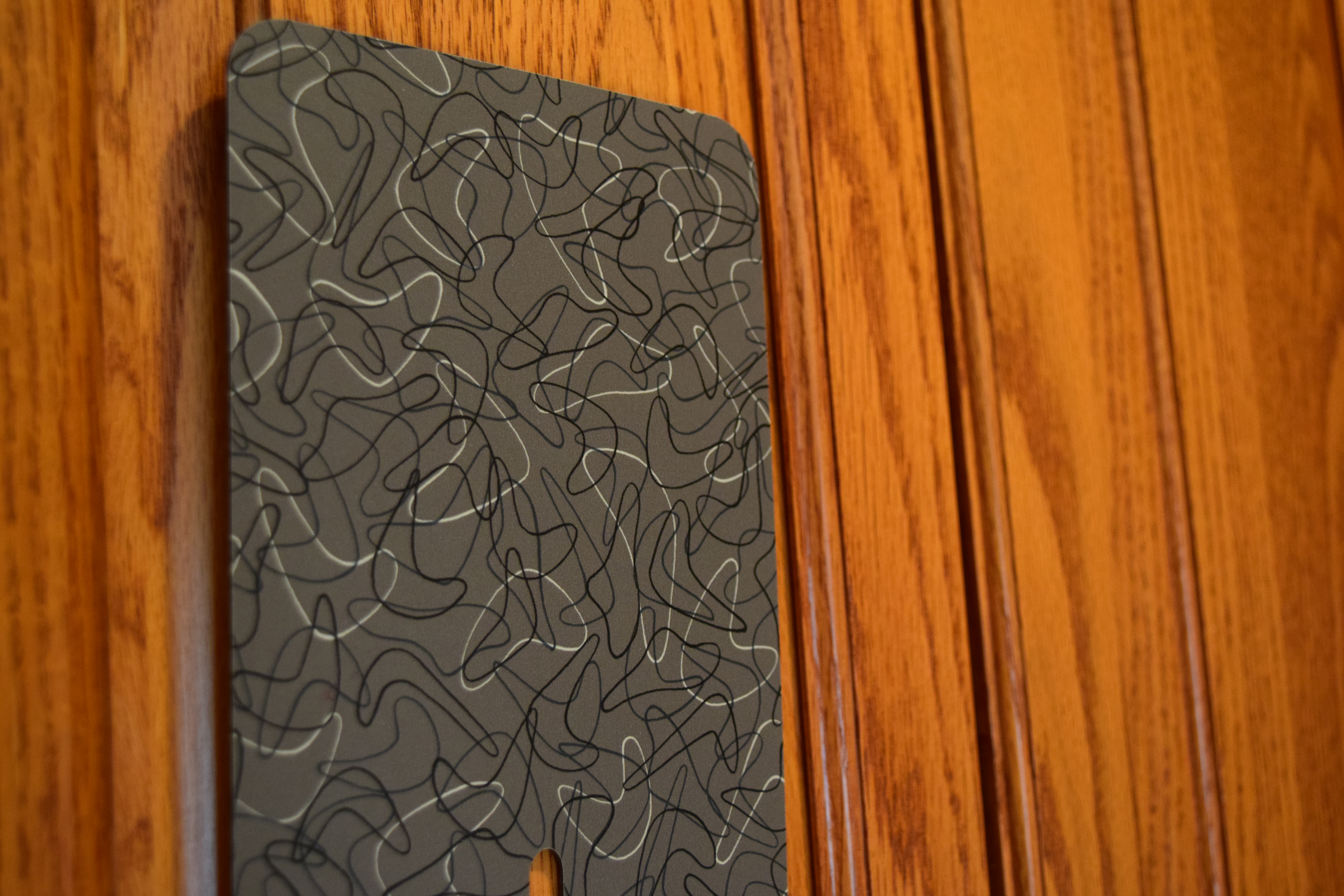
[Here’s the Charcoal Boomerang laminate with reddish oak cabinets. We tried the darker colors that I’ve seen with similar cabinets, but they just didn’t seem right. I keep coming back to this one.]
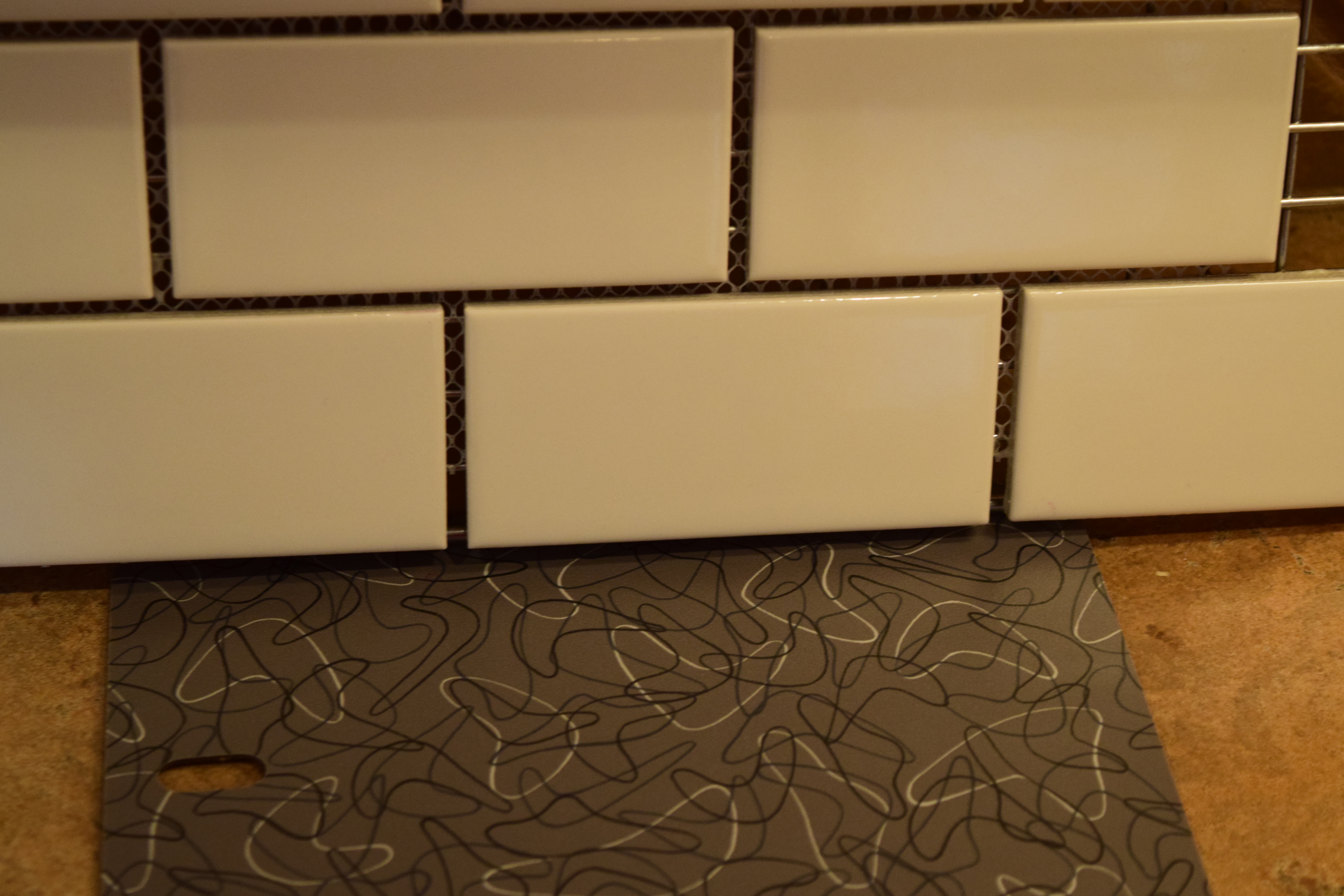
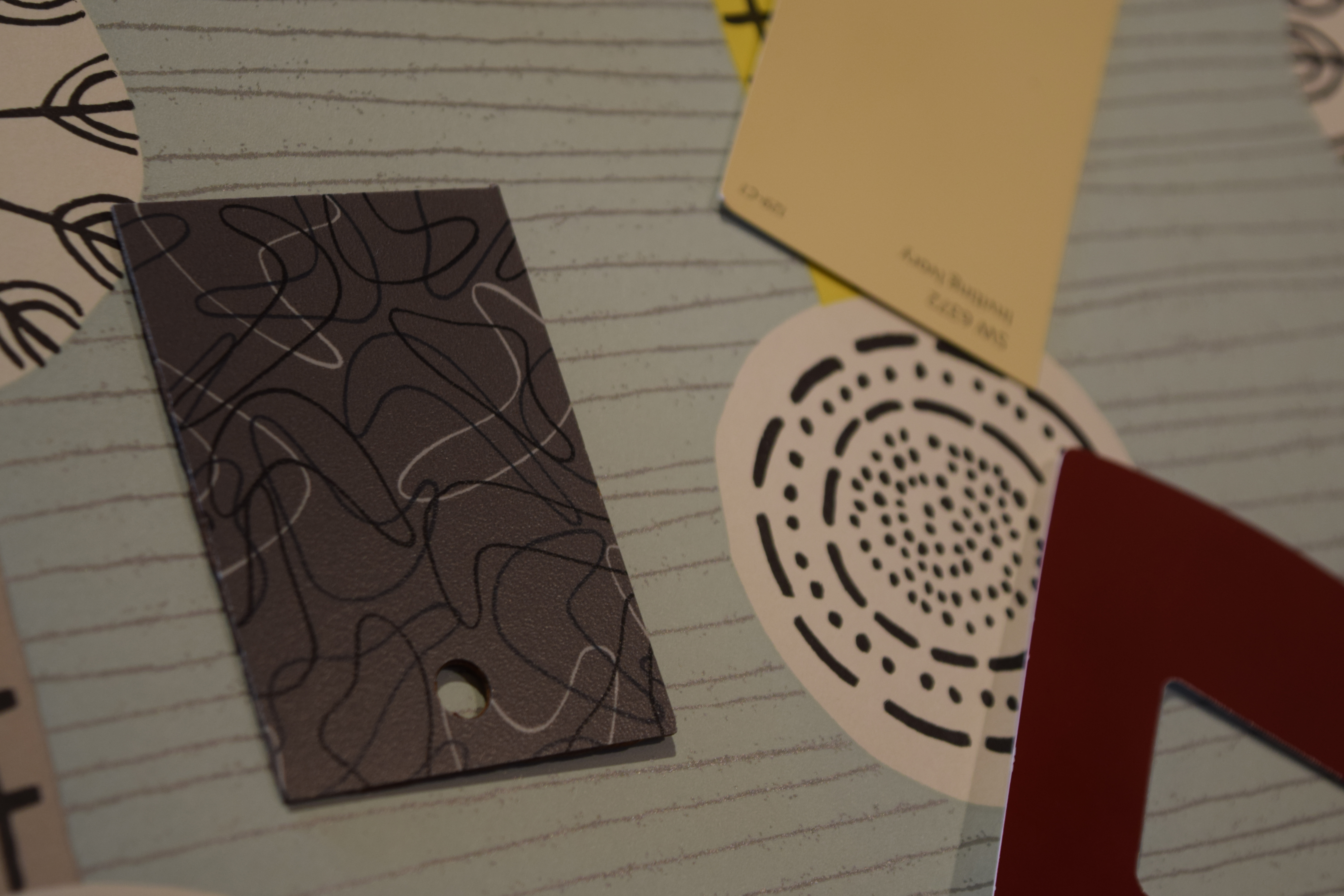
[Here’s the laminate with tile we are considering. Taking a tip from the person who was giving me advice about the wallpaper, I’m favoring straight lines. I love this size and to my eye it looks good. But I wonder if it is too small for the pattern on the laminate.]
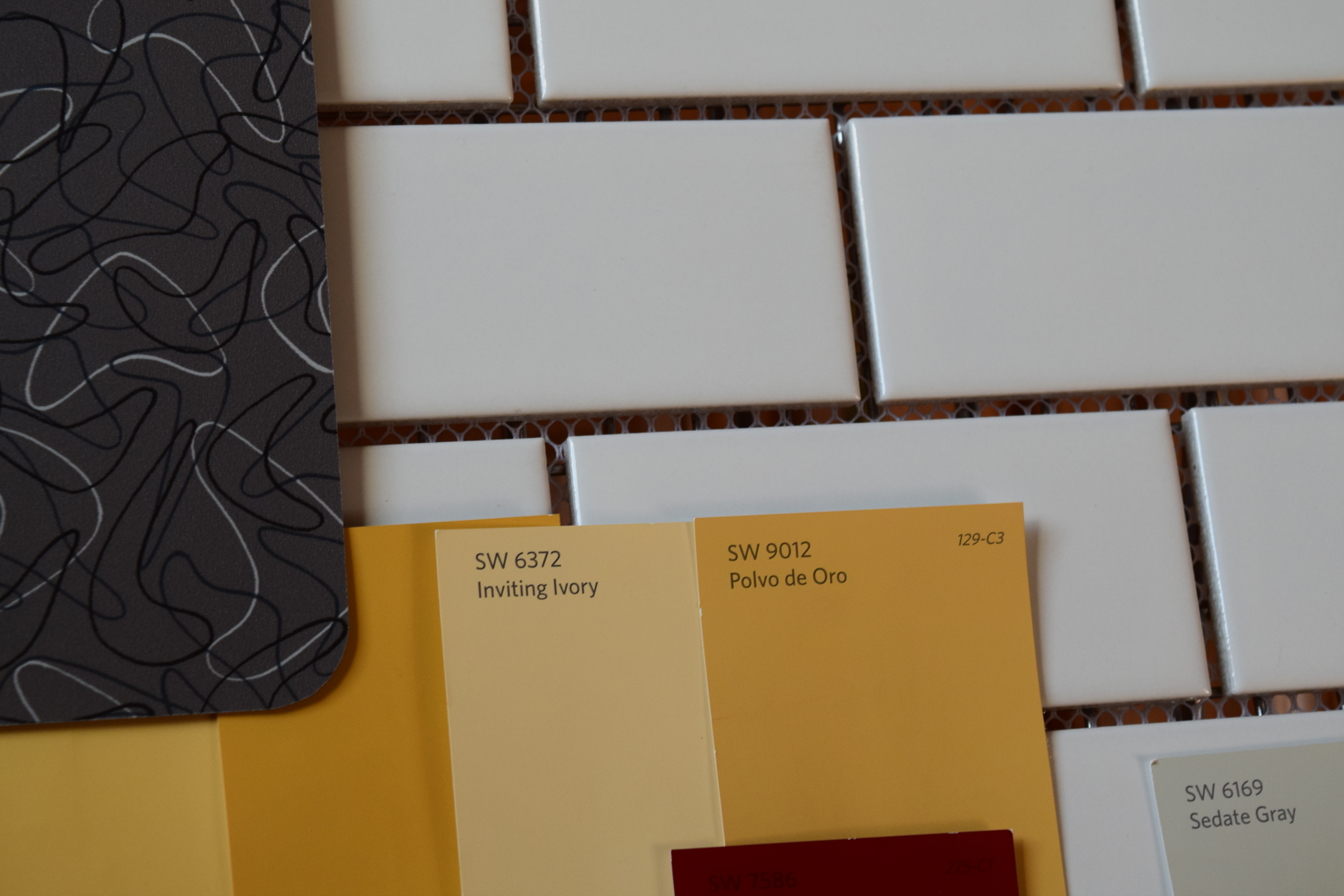
[Here’s everything together. I see I included Sedate Gray from Sherwin Williams. That will go in the bathroom off of the kitchen.]
This is still a work in progress, but we are getting closer to finalizing some decisions.
I love it all. I really like that paper, why can’t you use it? I think everything goes together so well.
I love it too! I was told that it wouldn’t be suitable wallpaper for a kitchen because it isn’t vinyl coated. It’s just paper and easily stained with stuff like oil. You wouldn’t be able to clean it. Having it on the back wall away from the stove might be an option. But I’m not inclined to take a chance with something that can’t be cleaned, especially since it would be near a door, a food prep area and a coffee nook. I thought about trying to paint the pattern on the wall.